Successful architectural presentation boardsserve as visual storytellers, encapsulating the essence of design concepts within a tangible, captivating format. These boards are dynamic canvases that architects and designers employ to articulate their vision, showcasing the fusion of creativity, functionality, and innovation.
These boards play a pivotal role in conveying design ideas by amalgamating various elements, sketches, renderings, material samples, and textual annotations, into a cohesive narrative. They transcend the boundaries of traditional blueprints, breathing life into abstract ideas and transforming them into tangible realities.
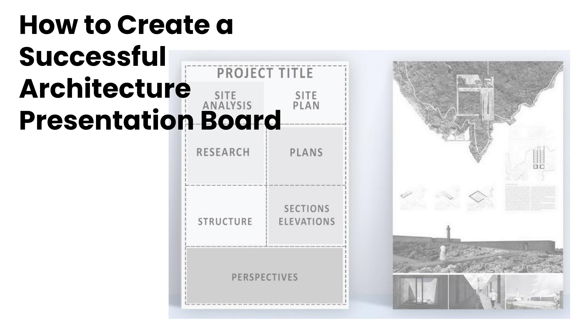
Key Elements Of A Successful Presentation Board
A captivating presentation board should not only inform but also engage your audience. While specific design choices come down to personal preference and context, certain general principles are crucial for building a successful board:
1. Clarity
- Focus on one key message -Don't overload the board with competing information. Prioritize the most impactful point you want your audience to remember.
- Simple language -Use concise and unambiguous language. Avoid jargon or overly technical terms unless your audience is familiar with them.
- Readability -Ensure text is large enough to be read from a distance and choose a clear, easy-to-read font.
- Consistent hierarchy -Clearly differentiate between headings, subheadings, and supporting text using size, color, and spacing.
2. Organization
- Logical flow -Arrange content in a way that leads the audience through your message effortlessly. Consider a chronological, cause-and-effect, or problem-solution approach.
- Use white space -Don't overcrowd the board. White space makes your content seem less cluttered and easier to absorb.
- Grouping related elements -Use visual cues like lines, boxes, or color to group related information and prevent confusion.
- Balance -Distribute elements evenly across the board to avoid creating an unbalanced or top-heavy feel.
3. Visual Appeal
- Color palette -Choose a limited color palette that is pleasing to the eye and aligns with your message or brand. Avoid clashing colors or too many bright hues.
- High-quality visuals -Use professional-looking images, charts, and graphs to illustrate your points and add visual interest. Avoid blurry or pixelated visuals.
- Minimalism -Less is often more. Avoid excessive decorations or embellishments that detract from your message.
- Typography -Choose a legible and aesthetically pleasing font that complements your overall design. Avoid using too many different fonts.
Choosing The Right Content For Your Board
Selecting the right content for your presentation board is crucial for capturing your audience's attention and effectively communicating your message. Here are some key considerations:
Types Of Content
Plans -Depending on your project, include relevant plans like floor plans, site plans, or sectional plans. Choose the plans that best showcase the essential aspects of your design.
Sections -Use sections to illustrate key areas of your project in detail. This could include elevations, perspectives, or details of specific design elements.
Elevations -Elevations showcase the external appearance of your design. Choose elevations that highlight the most striking features and overall character of the project.
Renderings -Renderings offer a realistic visualization of your design, helping viewers understand the completed project's look and feel. Choose renderings that capture the desired atmosphere and evoke the desired emotions.
Text -Use text sparingly and strategically. Include only essential information like headings, labels, and brief descriptions. Avoid lengthy paragraphs that bog down the visual impact.
Relevance And Conciseness
Focus on your message -Only include content directly relevant to your key message. Avoid anything that distracts or adds unnecessary complexity.
Less is more -Don't overload your board. Prioritize the most impactful elements and avoid cluttering the space with excessive details.
Tailor to your audience -Consider your audience's knowledge and interest level when selecting content. Avoid technical jargon or overly complex information that might be overwhelming.
Clarity over aesthetics -While visual appeal is important, prioritize clarity and ease of understanding above all else. Ensure your chosen content is readily comprehensible to your audience.
The Impact Of Graphic Design In Presentation Boards
Effective communication goes beyond just the spoken word. In the realm of presentation boards, graphic design principles act as silent partners, shaping how your message is received and resonated with. Let's delve into how typography, color schemes, and aesthetic coherence can transform a basic board into a captivating communication tool.
1. The Power Of Typography
Think of fonts as voices with distinct personalities. Choosing the right typeface conveys emotions, sets the tone, and guides the audience's reading experience.
Clear and Readable, opt for clean, legible fonts like Arial or Helvetica for text-heavy boards. Avoid overly decorative or script-like fonts that can be difficult to decipher.
Hierarchy and Emphasis, use different font sizes and weights to create a hierarchy of information. Larger, bolder fonts for headings and smaller, lighter fonts for supporting text.
Personality and Mood, play with fonts like Futura for a modern feel, Garamond for a classic touch, or Comic Sans for a playful vibe. Ensure the font choice aligns with your message and brand identity.
2. Color Schemes - Evoking Emotions And Creating Cohesion
Colors possess the power to influence moods, draw attention, and establish brand identity. A deliberate color palette can elevate your presentation board to new heights.
Psychological Impact, consider the emotions you want to evoke. Blue inspires trust and professionalism, while yellow exudes energy and optimism. Choose colors that align with your message and target audience.
Complementary Palettes, limit your color palette to 3-4 main hues. Use a color wheel to choose complementary or analogous colors that create a harmonious and pleasing visual experience.
Branding and Recognition, integrate your brand colors for instant recognition and consistency. This reinforces your brand message and builds trust with the audience.
3. Aesthetic Coherence - Tying it All Together
Cohesion is the golden thread that weaves all design elements into a unified whole. It's about creating a sense of visual order and balance that makes your board easy to navigate and understand.
Alignment and Grids - Align text, images, and elements consistently to create a sense of order and prevent visual clutter. Utilize grids as invisible frameworks to ensure balanced placement and spacing.
Negative Space - Don't underestimate the power of empty space. Leave enough white space around elements to let them breathe, enhancing readability and preventing a suffocating feel.
Visual Consistency - Maintain a consistent style throughout your board. Use similar fonts, colors, and design elements to avoid jarring transitions and create a unified visual language.
Incorporating Storytelling Into Your Boards
Presentation boards often fall prey to the dreaded information overload. Facts, figures, and technical jargon fill the space, leaving audiences glazed over and yearning for escape. But what if your boards could do more than just inform? What if they could captivate, engage, and leave a lasting impression? The answer lies in the ancient art of storytelling.
- The Power of Narrative - By incorporating storytelling into your presentation boards, you tap into this innate human desire, transforming dry information into a captivating journey.
- The Triumphant Resolution -Finally, reveal the successful outcome of your project's journey. This is your moment to showcase the impact, benefits, and the positive future your project creates.
- The Journey Unfolds -Showcase the steps your project takes to overcome the challenges. Use visuals, data, and key points to illustrate the progress and build anticipation.
- Build the Conflict -No hero exists without obstacles. Introduce the problems, challenges, or opposing forces your project faces. This creates tension and keeps the audience invested.
- Identify Your Hero -Every good story needs a hero, and in your case, it's your project, idea, or solution. Define its essence, its challenges, and its ultimate goal.
Connecting With Your Audience
- Personalize the Hero's Journey -Tailor the narrative to your audience's context and needs. Show how your project directly benefits them or addresses their concerns.
- Interactive Elements -Let your audience participate in the story. Use touchscreens, QR codes, or even simple questions to make them feel involved in the journey.
- Emotional Resonance -Tap into emotions that resonate with your audience. Use visuals, language, and examples that evoke empathy, excitement, or hope.
Digital Tools And Software For Crafting Boards
Gone are the days of messy hand-drawn sketches and hours spent fiddling with physical cutouts. The digital age has ushered in a plethora of powerful software tools that can help you craft stunning and impactful presentation boards with ease. Let's delve into some of the most popular options and explore how they can elevate your board-making game:
1. Adobe Creative Suite
Photoshop -The industry standard for image editing, Photoshopgrants you ultimate control over image manipulation, photorealistic mockups, and creating custom graphics.
Illustrator -Craft stunning vector graphics, illustrations, and icons with precision and scalability. Perfect for creating logos, diagrams, and intricate design elements.
InDesign -Layout and design like a pro with InDesign's intuitive interface and powerful tools. Ideal for creating professional-looking brochures, presentations, and, of course, presentation boards.
2. Canva
A user-friendly online platform perfect for beginners and design enthusiasts alike. Canvaboasts a vast library of templates, pre-designed elements, and drag-and-drop functionality, making board creation a breeze.
Experiment with different layouts, color schemes, and fonts to find the perfect aesthetic for your board.
Collaborate with team members in real-time and access your boards from any device.
3. Prezi
Ditch the static slides and embrace Prezi's dynamic zoom-and-reveal presentations. Create interactive presentations with multimedia elements and non-linear storytelling, captivating your audience with a unique experience.
Add videos, music, and even 3D objects to your boards, making them visually engaging and memorable.
Prezi's cloud-based platformallows you to access and edit your presentations from anywhere.
4. Lucidchart
Brainstorm, map out ideas, and create flowcharts, diagrams, and mind maps with ease using Lucidchart's intuitive interface.
Collaborate with your team in real-time and export your diagrams into various formats for seamless integration into your presentation boards.
Lucidchart's vast library of templates and symbols caters to diverse needs, from mind maps to wireframes.
5. Piktochart
Infographics come alive with Piktochart's user-friendly platform. Design visually appealing infographics, reports, and presentations with ease, even if you're not a design guru.
Choose from a variety of templates and customize them with Piktochart's extensive library of icons, charts, and images.
Export your infographics in various formats and embed them directly into your presentation boards.
Common Mistakes To Avoid In Presentation Boards
1. Clutter And Overcrowding
Mistake -Too much text, images, and elements competing for attention, creating a visual mess and overwhelming the viewer.
Solution - Employ ample white space to give elements room to breathe. Prioritize key information and visuals, removing anything non-essential. Use visual hierarchy (size, color, placement) to guide the viewer's eye.
2. Poor Text Formatting
Mistake -Unreadable text due to small font size, inconsistent fonts, or lack of contrast with the background.
Solution - Ensure text is legible from a distance (1-2 meters). Stick to 2-3 fonts that complement each other and the overall design. Choose high-contrast color combinations for text and background.
3. Low-Quality Images
Mistake -Blurry, pixelated, or poorly composed images that detract from the board's professionalism.
Solution - Use high-resolution images that are clear and visually appealing. Edit images to enhance lighting, contrast, and composition. Opt for professional photography or high-quality stock images.
4. Inconsistent Layout
Mistake -Disorganized layout with elements arranged haphazardly, creating a sense of chaos and hindering readability.
Solution - Establish a visual hierarchy using grids, alignment, and spacing. Group related elements together to create a clear structure. Use visual cues like lines, boxes, or color to guide the viewer's eye through the content.
Analyzing Examples Of Successful Presentation Boards
Let's delve into the world of compelling presentation boards by dissecting some real-world examples, each showcasing a distinct principle or technique that contributes to their impact:
1. Clarity Through Minimalism
- The Board -Zaha Hadid Architects' presentation board for the VitraHaus museum (Image of Zaha Hadid Architects' presentation board for the VitraHaus museum)
- The Technique -Minimalism and strong visuals.
- The Analysis -This board masterfully conveys the essence of the museum's fluid, dynamic form using just a few impactful elements. A single high-quality render dominates the board, showcasing the building's striking curves and integration with the landscape. Limited text and a clean layout further emphasize the visual simplicity, allowing the architecture to speak for itself.
- Takeaway -Less is often more. Trust powerful visuals and prioritize clarity over clutter to make a lasting impression.
2. Storytelling Via Journey
- The Board -BIG Architects' presentation board for the 10th Avenue office building in New York City (Image of BIG Architects' presentation board for the 10th Avenue office building in New York City)
- The Technique -Narrative structure and sequential visuals.
- The Analysis -This board tells a story of the building's connection to its urban context. It starts with a wide aerial view, then zooms in to reveal the building's unique form and relationship to the street grid. Finally, it showcases interior spaces and the building's contribution to the city's vibrancy. This sequential, narrative approach draws the viewer in and creates a deeper understanding of the project's impact.
- Takeaway -Weave a narrative into your board. Use visuals to guide the viewer on a journey, connecting your project to its context and highlighting its benefits.
3. Emotional Resonance With Color
- The Board -Snøhetta's presentation board for the SFMOMA expansion (Image of Snøhetta's presentation board for the SFMOMA expansion)
- The Technique -Strategic color palette and evocative imagery.
- The Analysis -This board uses a calming blue-green color palette to evoke feelings of nature and tranquility, aligning with the project's focus on creating a welcoming and open space. The imagery further reinforces this emotional connection, showcasing lush greenery and natural light flooding into the museum's expansion.
- Takeaway -Consider the emotions you want to evoke and choose colors and visuals that resonate with your audience.
4. Interactive Engagement With Technology
- The Board -Studio Gang's presentation board for the National Center for Civil and Human Rights in Atlanta (Image of Studio Gang's presentation board for the National Center for Civil and Human Rights in Atlanta)
- The Technique -Interactive elements and multimedia content.
- The Analysis - This board goes beyond static visuals, incorporating a QR code that links to a video showcasing the building's design and significance. For seamlessly creating engaging video content like this, consider using FlexClip, a versatile online video editing tool. This interactive element captivates the audience and allows them to explore the project in greater depth.
- Takeaway -Embrace technology to create an interactive experience. QR codes, videos, or even touchscreens can add another layer of engagement and understanding.
Conclusion
Mastering the art of architectural presentationboards hinges on several key elements that collectively ensure their success. Firstly, a clear narrative and cohesive story are paramount, structuring information in a logical flow that guides viewers through the design journey.
It's the bridge that connects abstract concepts to tangible realities, enabling professionals to articulate their vision vividly and persuasively. By honing these skills, architects not only elevate their designs but also forge stronger connections with clients, stakeholders, and the community, fostering a deeper appreciation and understanding of the architectural marvels that shape our world.